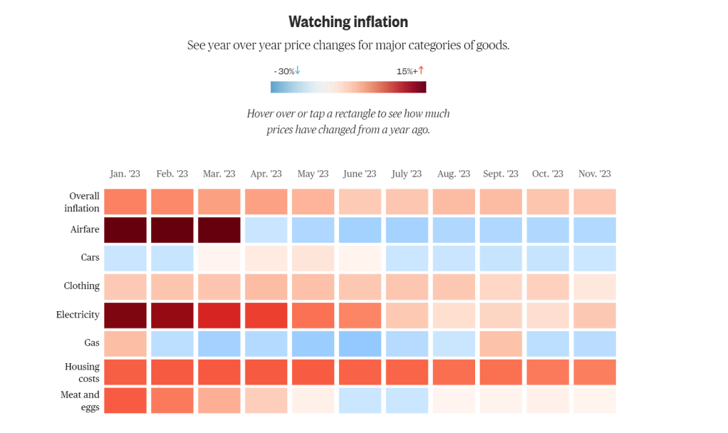
In recent weeks the visual of analytics that has caught my eye is this representation of inflation in the U.S over the course of 2023.
Source: Bureau of Labor Statistics and Energy Information Administration
This visual was presented by NBC News in an article describing the rise and fall of inflation over the course of the past year. I find it to be a good representation of statistics being displayed in a clear manner that is easily interpreted by a general audience. This visual goes a step further by also being interactive. On NBC New’s page, if you hover over each square, you can see the exact percent of change for each month of each category.
It is obvious that a lot of data had to be munged in order for these numbers to be calculated, and it can be difficult to display such complex and large portions of information, but the Bureau of Labor Statistics clearly had a goal for the general public to understand their interpretation of all of the numbers and executed this visual so that the public may be accurately and efficiently educated.

Leave a comment