For this assignment we were asked to provide a basic data visual using Rstudio.
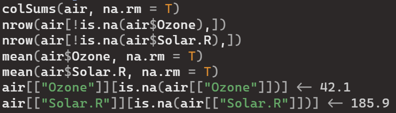
I decided to use a simple dataset provided in the R package called “air”. I first cleaned the data:
Then I used the ggplot2 package to create two histograms representing two different variables. I did this to showcase the difference in scale per variable and how color contrast is an important factor in “bar” visuals.

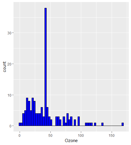

I think my basic visualization does fit into Few’s and Yau’s discussions because they talk about clear and accurate representations which is what I believe I have produced here. The color contrast on the plots makes it easy for the viewer to interpret and analyze the data all while staying concise and accurate to the data’s original form.

Leave a comment