In this assignment we were asked to delve into the application of Stephen Few’s recommendations on utilizing grids to enhance the comparison of scatter plots for variables. To illustrate this concept, I conducted an analysis using the widely known mtcars data set, which contains information about various car attributes.
Few advocates for the use of grids to facilitate the comparison of distributions across multiple variables. By arranging scatter plots in a grid layout, analysts can easily identify patterns, trends, and outliers without the cognitive load of switching between different plots. This approach fosters efficient exploration of data and aids in uncovering relationships between variables.
To implement Few’s recommendations, I utilized the ggplot2 package in R to generate histograms for each variable in the mtcars data set. By arranging these histograms in a grid layout using the gridExtra package, I created a comprehensive visualization for comparative analysis.
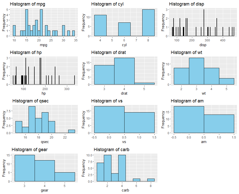
The grid-based visualization revealed interesting insights into the distributions of car attributes. For instance, the histograms for variables such as “mpg” (miles per gallon) and “wt” (weight) exhibited bimodal distributions, indicating the presence of distinct subgroups within the data. On the other hand, variables like “hp” (horsepower) and “qsec” (quarter mile time) displayed relatively symmetric distributions.
Few’s recommendations proved valuable in facilitating the exploration of data distributions. The grid layout offered a structured framework for comparing scatter plots, enabling analysts to discern patterns and anomalies more effectively. By adhering to principles of simplicity and clarity, the visualization provided a deeper understanding of the underlying data.

Leave a comment