For this assignment I decided to show the correlation between the “mpg” and “cyl” variables from the mtcars dataset.

For this data set I thought the best way to clearly visualize the correlation would be to provide the smoothed linear regression line.
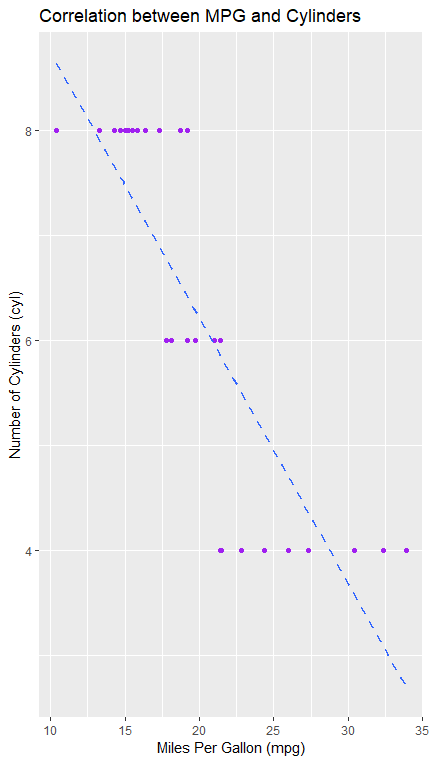
As you can see, because the line is diagonally slanted back toward the top left of the graph , we can infer that the number of cylinders and the miles per gallon of the cars have a high negative correlation.
few’s recommendation to include the grid lines helped me in this assignment because it allows for the viewer to clearly see the values of the variables, especially “cyl”. In this case, it is important for the viewer to understand that the cylinder counts only varied by increments of 2.

Leave a comment