For this assignment we were asked to take a dataset and create three different visualizations in R using three different techniques. For this assignment I decided to use the “iris” dataset to compare flower petal lengths by species:
Basic Visualization:
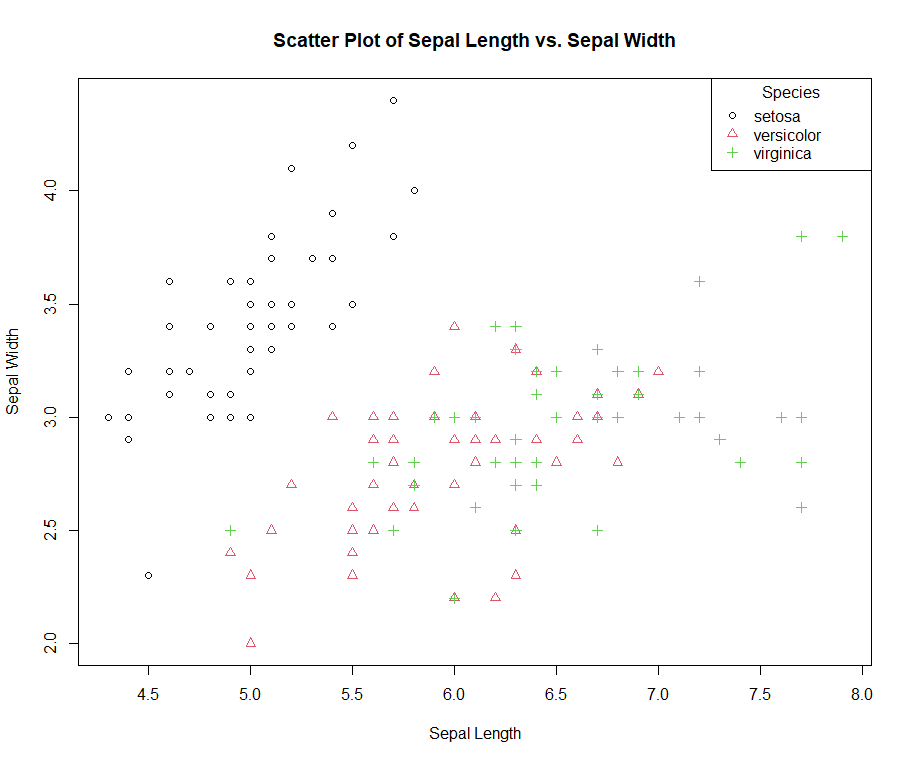
In this basic R visualization I chose to create a scatterplot that displays the “species” variables that are represented by both symbols and colors. This level of dimension creates contrast in the plot so the viewer can clearly see overlaps as well as recognize trends within the individual species.
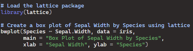
Lattice Visualization:
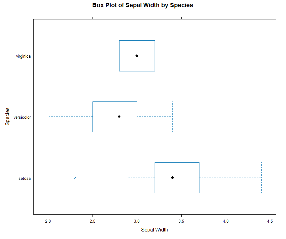
In this box and whiskers plot I used the “lattice” package in R to visualize more of a statistical summary of the same dataset. The mean, quartiles, minimums, and maximums of the sepal widths by species are easily recognizable in this plot.
ggplot2 Visualization:
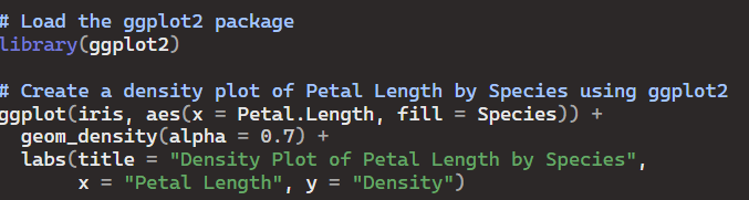

I personally prefer using the ggplot2 package in R for most of my visuals because of how much control it provides the user. I decided to represent the petal lengths in a density plot. out of all of the plots in this assignment I think this visual is most appealing to the eye/efficient for viewers. the ggplot2 package allows me to adjust the transparency(alpha) of the variables so overlap is clearly displayed. The large variance between species is also well displayed by the height differences of the density geometries.
GitHub Repository:

Leave a comment