For this assignment we were asked to create a multivariate plot and describe how we used the 5 principles of multivariate analysis.
For the plot I used ggplot2 in Rstudio and used a dataset that provided various Fawn statistics.
- Alignment:
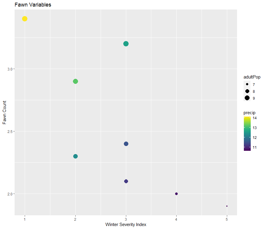
- The x-axis represents the Winter Severity Index, and the y-axis represents Fawn Count. These axes are aligned along the bottom and left sides of the plot area, creating a sense of order and organization.
- The axis labels, “Winter Severity Index” and “Fawn Count”, are aligned with their respective axes, ensuring clarity in interpretation.
- Repetition:
- Repetition is seen in the use of aesthetic mappings within the
geom_point()layer:- Color is mapped to the variable “precip”, which represents precipitation.
- Size is mapped to the variable “adultPop”, representing adult population size.
- This repetition helps reinforce the relationships between the plotted variables and their respective aesthetics, enhancing understanding.
- Contrast:
- Contrast is evident in the use of different colors and sizes for the points in the plot:
- Color variation indicates different levels of precipitation.
- Size variation indicates different levels of adult population.
- This contrast allows viewers to distinguish between different data points based on these variables easily.
- Proximity:
- Proximity is observed in the grouping of related elements:
- The data points are grouped together in the plot area based on their coordinates, with closer points representing similar values of Winter Severity Index and Fawn Count.
- The axis labels are placed close to their respective axes, providing contextual information in proximity to the plotted data.
- Balance:
- Balance is achieved through the distribution of visual elements across the plot area:
- The data points, axis labels, and legend are distributed evenly within the plot, creating a harmonious composition.
- There is no apparent visual imbalance that could distract viewers from interpreting the relationships between the variables.
By applying these principles of design, the ggplot graph effectively communicates the relationships between the Winter Severity Index, Fawn Count, precipitation, and adult population size in the dataset.

Leave a comment