For this assignment we were asked to visualize a time series of our choosing. I chose to visualize the “airquality” data set in R because I knew that this data provided multiple observations over a series of time.
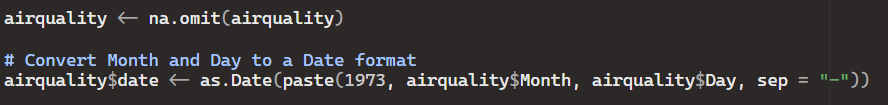
The first thing I had to do was omit NAs within the data and convert the “Month” and “Day” columns into a Date format.
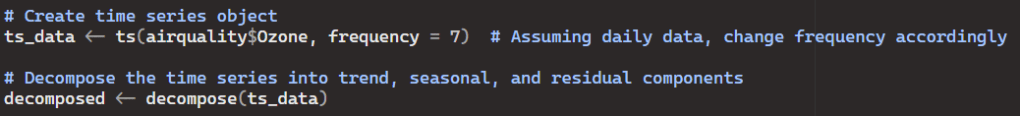
Next I needed to create a time series object and decompose the series into trend, seasonal, and residual components.
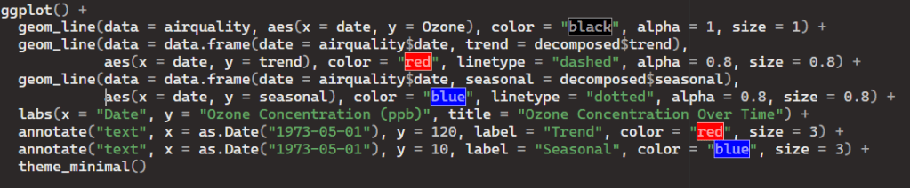
Finally, I used the ggplot2 package to create a visual unique to the data.
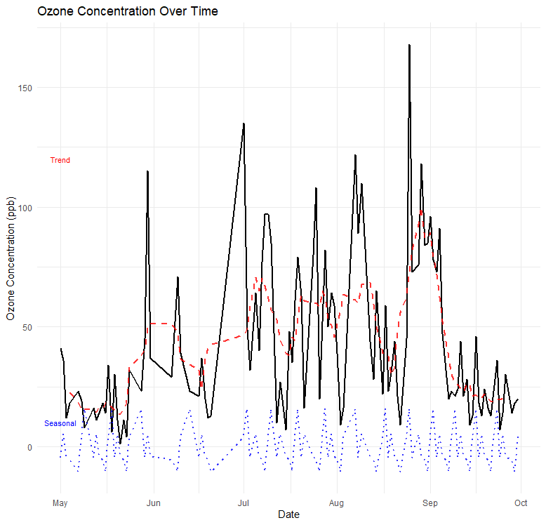
Original Ozone Concentration Data:
- The black line represents the original ozone concentration data over time. This component serves as the foundation of the visualization, providing viewers with direct insight into the actual measurements recorded. Its color contrast against the background makes it easily distinguishable and ensures it remains the focal point of the plot.
Trend Component:
- The red dashed line depicts the underlying trend in the ozone concentration data. By visually isolating the trend component from the original data, viewers can identify long-term patterns or changes over time. The trend line’s color and line type (dashed) clearly differentiate it from both the original data and the seasonal component, guiding viewers’ focus specifically to the overarching trend.
Seasonal Component:
- The blue dotted line illustrates the seasonal variation in the ozone concentration data. It represents periodic fluctuations that occur regularly within the time series, such as seasonal peaks or troughs. By overlaying the seasonal component on the plot, viewers can discern cyclic patterns and understand how the ozone concentration varies across different seasons throughout the year.
Annotations:
- Text annotations labeled “Trend” and “Seasonal” provide explicit guidance on interpreting the different components of the time series. These annotations serve as signposts, directing viewers’ attention to key features and aiding in the understanding of the plot. By explicitly labeling the trend and seasonal components, viewers can quickly identify and differentiate between these elements without ambiguity.

Leave a comment