This week we were asked to create a visualization that Dr. Piwek mentions in his post about Tufte’s concepts. I chose to generate a Marginal Histogram Scatter Plot.
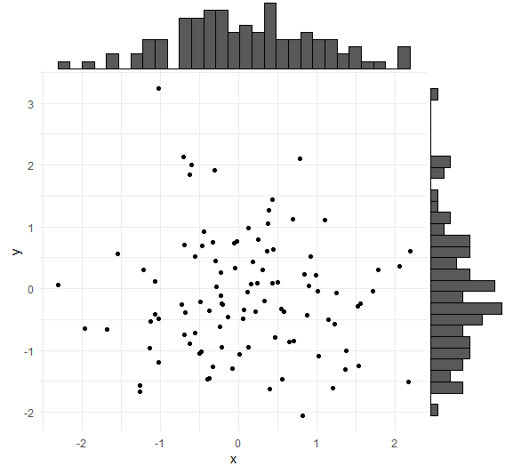
In the provided visual, which I created using a basic data frame, the concepts advocated by Edward Tufte are applied in several ways:
- Maximizing data-ink ratio: The plot effectively communicates the relationship between two variables (x and y) using minimal ink. The scatter plot itself displays the data points, maximizing the data-ink ratio by dedicating most of the ink to conveying meaningful information. Additionally, the marginal histograms provide additional insights into the distribution of data without adding unnecessary complexity.
- Minimizing chartjunk: The plot is kept simple and free from unnecessary clutter. Axis labels and ticks are removed from the marginal histograms to avoid distractions and focus attention on the data. This adherence to simplicity and clarity aligns with Tufte’s principle of eliminating non-data ink and minimizing unnecessary visual elements that do not contribute to understanding.
- Clarity and effectiveness: The use of marginal histograms enhances the clarity and effectiveness of the plot by providing additional context and insights into the distribution of data along each axis. This approach allows viewers to simultaneously grasp both the overall trend in the scatter plot and the distribution of individual variables, facilitating a deeper understanding of the data.
- Aesthetic appeal: The plot maintains a clean and visually appealing appearance, which is essential for engaging viewers and encouraging exploration of the data. The choice of colors for the points and histograms is visually pleasing without being overly distracting, contributing to the overall aesthetic appeal of the visualization.

Leave a comment