In the realm of data visualization, animation serves as a powerful tool to convey dynamic trends, transitions, and changes over time. R, being a versatile programming language for statistical computing and graphics, offers various packages to create captivating animations directly within its environment. In this assignment, I created a simple example inspired by the work of Yihui Xie and Bryan’s insightful blog post.
The Animation: A Simple Example
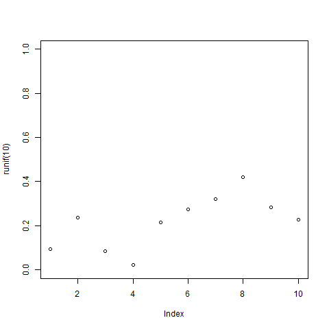
I decided to create a basic animation showcasing the evolution of random data points over a series of frames. The animation will depict ten frames, each displaying a plot of ten randomly generated points.
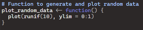
First I create the function to generate and plot random data:
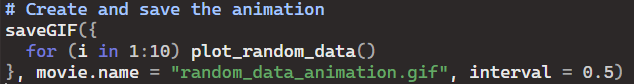
Then, I created the animation:
- Plotting Function: The plot_random_data() function generates ten random points and plots them against a fixed y-axis range from 0 to 1.
- Animation Creation: Within the saveGIF() function, a loop iterates ten times, each time calling the plot_random_data() function to generate a plot. These plots are then sequentially compiled into a GIF animation.
- Save Animation: The resulting animation is saved as “random_data_animation.gif” in the current working directory.
- Animation Playback: Once saved, the GIF animation can be opened and played in any compatible viewer, showcasing the dynamic evolution of the random data points.
Conclusion
Animating data adds a layer of interactivity and storytelling to visualizations, enabling viewers to better comprehend trends and patterns over time. With R’s animation capabilities, users can create engaging visual narratives directly within the R environment.

Leave a comment